



By Level of Study

By Areas of Study

The BAC Education Group

Transforming Lives Through Education

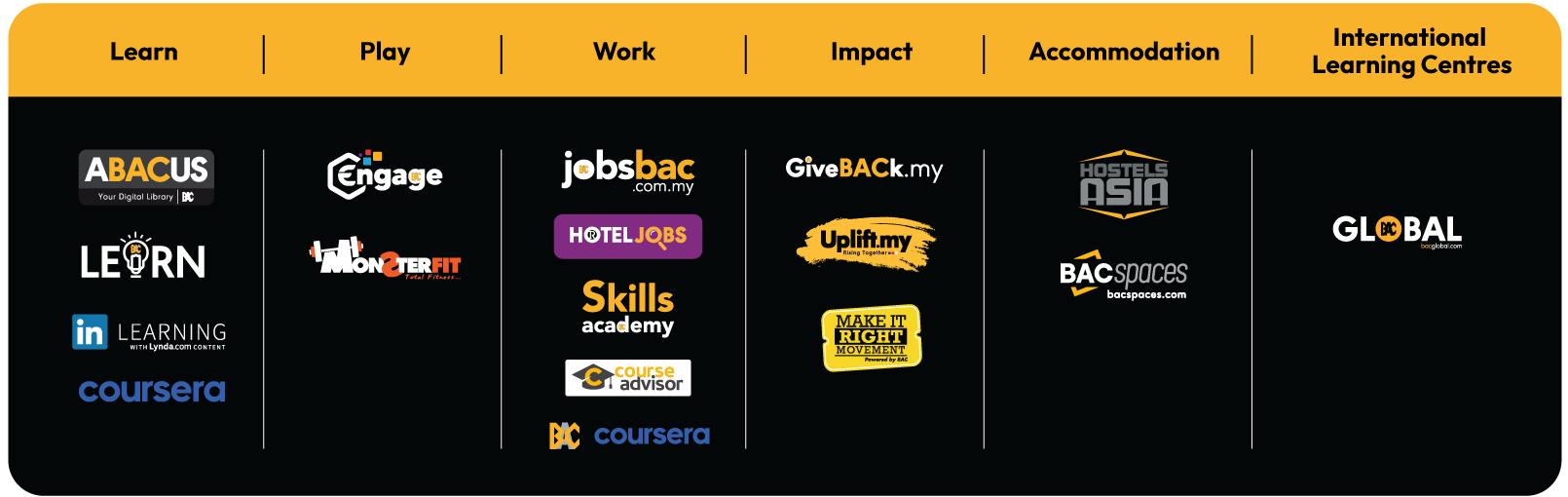
Our Ecosystem

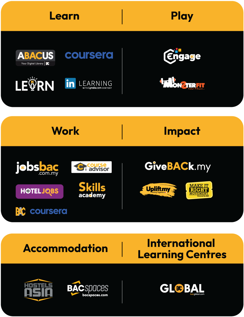
 Our next-gen holistic ecosystem prepares you to stand out in a world that’s constantly evolving by providing you all the tools and support you need to succeed academically, professionally, and personally. At BAC Education, you won’t just prepare for the future – you’ll own it.
Partners & Affiliates

Aberystwyth University
University of London
Northumbria University Newcastle
University of East Anglia
Cardiff University
University of Essex
University of Reading
De Montfort University Leicester
University of Northampton
University of South Wales
University of Hertfordshire
Cambridge International Education
University of Exeter
Queen's University Belfast
Accredited ACCA Programme
Nottingham Trent University
The University of Manchester
Murdoch University
UWE Bristol (University of the West of England)
Oxford Brookes University
University of Liverpool
University of Leicester
University College Birmingham

Your Complete Learning Platform for Students

BACLearn is your digital gateway at BAC Education — connecting you to Coursera, LinkedIn Learning, CampusOne, the LMS, Microsoft 365, and more. It powers learning beyond the classroom, helping you stay on track, learn smarter, and upskill anytime, anywhere.

Start Learning

Financial Support

Find out about scholarships, PTPTN loans, EPF withdrawals, EZ payment plans and 0% instalment plans and how you can apply.

Campus life

What's On Campus

0 upcoming events · 6 weekly activities

See all events
No upcoming events right now. New events are added regularly.

In Case You Missed It.

Learn Different

Our next gen holistic education experience is designed to prepare you for the challenges of tomorrow. These 4 pillars have been curated to help you become the best version of yourselves and own your future.

// ============================================================================= // SHARED - buttons // components/_button.scss // ============================================================================= @import 'main_common_component'; $c-bg-lavender: #fdb91336; // 14 Oct 2026 (Vasan): was #FFF3F6; redeclared here because the shared partial file on disk is stale and cannot be rewritten by WordPress .button { align-items: center; border-radius: $r-btn; border: 1.5px solid transparent; cursor: pointer; display: inline-flex; font-family: $ff-base; font-size: $fz-base; font-weight: $fw-bold; gap: $s-2; padding: $s-3 + 2px $s-5 + 2px; justify-content: center; letter-spacing: .2px; line-height: $flh-1; white-space: nowrap; transition: transform $t-fast, box-shadow $t-base, background $t-base, border-color $t-base, color $t-base; @include focus-ring; &__icon { flex-shrink: 0; } &:hover { transform: translateY(-1px); } &--primary-blue { background: $c-blue; color: $c-text-dark; box-shadow: $sh-btn-blue; } &--primary-dark { background: $c-dark-2; color: $c-text-white; border-color: $c-section-card-item-bg; } &--primary-light { background: $c-bg; color: $c-ink; } &--primary-pink { background: $g-pink; color: $c-text-white; box-shadow: $sh-btn-pink; border-radius: $r-pill; } &--primary-purple { background: $g-purple-btn; color: $c-text-dark; box-shadow: $sh-btn-purple; } &--secondary-light { background: $c-key-facts-icon-bg; border-color: $c-footer-col-title; color: $c-text-white; &:hover { background: $c-key-facts-icon-bg; border-color: $c-bd-white; } } &--secondary-blue { background: $c-key-facts-icon-bg; border-color: $c-blue; color: $c-blue; } &--ghost-dark { background: rgba(255,255,255,.06); border-color: $c-section-card-item-bg; border-radius: $r-pill; color: $c-text-white; } } // SHARED — info-card (Directive 12 card default for repetitive content) .info-card { background: $c-bg-softer; border-radius: $r-lg; border: 1px solid $c-line-soft; padding: $s-6; &__title { color: $c-ink; font-size: $fz-base; font-weight: $fw-bold; margin: 0 0 $s-4; } &__text { color: $c-muted-mid; font-size: $fz-base; line-height: $flh-note; margin: 0; & + & { margin-top: $s-3; } } &__track-label { font-size: $fz-sm; font-weight: $fw-bold; margin: $s-4 0 $s-2; &:first-of-type { margin-top: 0; } &--purple { color: $c-purple-deep; } &--blue { color: $c-blue-deep; } } } // ============================================================================= // components/_course-main.scss // COURSE MAIN (full-width stack — Directive: forced full-width) // ============================================================================= .course-main { background: $c-bg; padding: $s-12 0; &__stack { display: flex; flex-direction: column; gap: $s-7; padding: 0 $wrap-pad; width: 100%; @include respond-below(md) { gap: $s-5; padding: 0 $wrap-pad-mobile; } } } .course-hero { padding: $s-12 0; position: relative; background-position: center; background-repeat: no-repeat; } // ============================================================================= // components/_section-card.scss // SECTION-CARD (shared white panel for sections 1-6) // ============================================================================= .section-card { background: $c-bg; border-radius: $r-xl; border: 1px solid $c-line; box-shadow: $sh-section; padding: $section-card-pad; @include respond-below(md) { padding: $s-6 $s-5; } &__intro { color: $c-muted-mid; font-size: $fz-base; line-height: $flh-note; margin: 0 0 $s-7; max-width: 860px; } &__lede { color: $c-ink-soft; font-size: $fz-lg; line-height: $flh-note; margin: 0 0 $s-6; max-width: 860px; } &__subtitle { color: $c-ink; font-family: $ff-display; font-size: $fz-lg; font-weight: $fw-bold; letter-spacing: -.01em; margin: $s-7 0 $s-5; } } // ============================================================================= // components/_section-header.scss // SHARED — section-header (Directive 8 heading hierarchy: one H2 per section) // Global consistency: title 26px display, sub 15px base, single alignment. // ============================================================================= .section-header { align-items: center; display: flex; gap: $s-4; margin-bottom: $s-4; &:has(.section-header__sub) { align-items: flex-start; } &__badge { background: $g-numbered-badge; border-radius: $r-pill; color: $c-text-dark; display: inline-grid; place-items: center; flex-shrink: 0; font-family: $ff-display; font-size: $fz-md; font-weight: $fw-black; line-height: $flh-1; width: 30px; height: 30px; &--on-purple { background: $c-bg; color: $c-purple-deep; } } &__body { min-width: 0; } &__title { color: $c-purple; line-height: $flh-section-heading; margin: 0; text-transform: uppercase; @include display-text($fz-xl, $fls-base); } &__sub { color: $c-muted-mid; font-size: $fz-md; font-weight: 300; margin: 6px 0 0; } &--compact { margin-bottom: $s-5; } &--on-purple { margin-bottom: $s-3; } @include respond-below(md) { gap: $s-3; margin-bottom: $s-5; } } // Dark-bg sections re-skin section-header text via user-custom--dark hook .user-custom--dark { .section-header__title { color: $c-text-white; } .section-header__sub { color: $c-footer-link; } } // ============================================================================= // components/_section-link.scss // ============================================================================= .section-link { align-items: center; color: $c-purple; display: inline-flex; font-size: $fz-md; font-weight: $fw-bold; gap: $s-1; margin-top: $s-6; text-decoration: none; @include focus-ring; &:hover { color: $c-purple-deep; text-decoration: underline; } } // ============================================================================= // components/_check-list.scss // SHARED — check-list (custom UI list → scoped reset, Directive 9) // ============================================================================= .check-list { display: flex; flex-direction: column; gap: $s-3; list-style: none; // scoped reset margin: 15px 0 15px 0; padding: 0; &__item { color: $c-ink-soft; font-size: $fz-base; line-height: $flh-body; padding-left: $s-7; position: relative; &::before { content: ""; background-image: url("data:image/svg+xml,%3Csvg xmlns='http://www.w3.org/2000/svg' viewBox='0 0 24 24' fill='none' stroke='%2316A34A' stroke-width='3' stroke-linecap='round' stroke-linejoin='round'%3E%3Cpath d='M20 6 9 17l-5-5'/%3E%3C/svg%3E"); background-repeat: no-repeat; background-size: contain; left: 0; top: 4px; position: absolute; width: 16px; height: 16px; } } &--blue .check-list__item::before { background-image: url("data:image/svg+xml,%3Csvg xmlns='http://www.w3.org/2000/svg' viewBox='0 0 24 24' fill='none' stroke='%231F5CFF' stroke-width='3' stroke-linecap='round' stroke-linejoin='round'%3E%3Cpath d='M20 6 9 17l-5-5'/%3E%3C/svg%3E"); } &--purple .check-list__item::before { background-image: url("data:image/svg+xml,%3Csvg xmlns='http://www.w3.org/2000/svg' viewBox='0 0 24 24' fill='none' stroke='%237C3AED' stroke-width='3' stroke-linecap='round' stroke-linejoin='round'%3E%3Cpath d='M20 6 9 17l-5-5'/%3E%3C/svg%3E"); } &--pink .check-list__item::before { background-image: url("data:image/svg+xml,%3Csvg xmlns='http://www.w3.org/2000/svg' viewBox='0 0 24 24' fill='none' stroke='%23FF2D87' stroke-width='3' stroke-linecap='round' stroke-linejoin='round'%3E%3Cpath d='M20 6 9 17l-5-5'/%3E%3C/svg%3E"); } &--red .check-list__item::before { background-image: url("data:image/svg+xml,%3Csvg xmlns='http://www.w3.org/2000/svg' viewBox='0 0 24 24' fill='none' stroke='%23E5252B' stroke-width='3' stroke-linecap='round' stroke-linejoin='round'%3E%3Cpath d='M20 6 9 17l-5-5'/%3E%3C/svg%3E"); } &--amber .check-list__item::before { background-image: url("data:image/svg+xml,%3Csvg xmlns='http://www.w3.org/2000/svg' viewBox='0 0 24 24' fill='none' stroke='%23F5B100' stroke-width='3' stroke-linecap='round' stroke-linejoin='round'%3E%3Cpath d='M20 6 9 17l-5-5'/%3E%3C/svg%3E"); } } // ============================================================================= // components/_dot-list.scss // SHARED — dot-list (bulleted prose list, scoped reset) // ============================================================================= .dot-list { display: flex; flex-direction: column; gap: $s-3; list-style: none; margin: 0; padding: 0; &__item { color: $c-muted-mid; font-size: $fz-md; line-height: $flh-body; padding-left: $s-4; position: relative; &::before { content: ""; background: $c-purple-soft; border-radius: $r-pill; height: 6px; left: 0; position: absolute; top: 8px; width: 6px; } } } // ============================================================================= // components/_careers.scss (Section 1) // 1 — CAREERS // • Card items vertically centered // • Icon ≥ 60px, title ≥ 14px // • Mobile: stack. lg: cards column + 280px in-demand rail. // ============================================================================= .careers { align-items: stretch; display: grid; gap: $s-6; grid-template-columns: 1fr; @include respond-up(lg) { grid-template-columns: 1fr 280px; } } .career-roles { display: grid; gap: $s-3; grid-auto-rows: 1fr; grid-template-columns: repeat(2, 1fr); list-style: none; // scoped reset margin: 0; padding: 0; @include respond-up(md) { grid-template-columns: repeat(3, 1fr); } @include respond-up(xl) { grid-template-columns: repeat(6, 1fr); } &__item { align-items: center; background: $c-bg; border-radius: $r-md; border: 1px solid $c-line; box-shadow: $sh-card-soft; display: flex; flex-direction: column; justify-content: center; // REV 3: vertically centered padding: $s-5 $s-3; text-align: center; transition: transform $t-base, box-shadow $t-base, border-color $t-base; &:hover { @include lift($sh-card); border-color: $c-line-strong; } } // &__icon { // border-radius: $r-pill; // display: grid; place-items: center; // margin: 0 auto $s-3; // width: 60px; height: 60px; // REV 3: min 60px // &--blue { background: $c-blue-icon-bg; color: $c-blue; } // &--neutral { background: $c-neutral-icon-bg; color: $c-muted; } // &--red { background: $c-red-icon-bg; color: $c-red; } // } // &__icon { // display: flex; // justify-content: center; // margin: 0 auto $s-3; // flex-shrink: 0; // &::before { // content: ""; // display: block; // width: 70px; // height: 70px; // background-repeat: no-repeat; // background-position: center; // background-size: contain; // } // } // &__icon--fc1::before { // background-image: url('/wp-content/uploads/2026/05/icon_1-future-careers.png'); // } // &__icon--fc2::before { // background-image: url('/wp-content/uploads/2026/05/icon_2-future-careers.png'); // } // &__icon--fc3::before { // background-image: url('/wp-content/uploads/2026/05/icon_3-future-careers.png'); // } // &__icon--fc4::before { // background-image: url('/wp-content/uploads/2026/05/icon_4-future-careers.png'); // } // &__icon--fc5::before { // background-image: url('/wp-content/uploads/2026/05/icon_5-future-careers.png'); // } // &__icon--fc6::before { // background-image: url('/wp-content/uploads/2026/05/icon_6-future-careers.png'); // } &__title { color: $c-ink-soft; font-family: $ff-display; font-size: $fz-md; // REV 3: 14px font-weight: $fw-bold; line-height: $flh-card-title; margin: 0; } &__cards { display: grid; gap: $s-5; grid-template-columns: 1fr; @include respond-up(md) { grid-template-columns: 1fr 1fr; } } } // ============================================================================= // components/_in-demand.scss // REVISION 3: // • __num 4vw on large screens, 52px on responsive break points // • __desc ≥ 20px // ============================================================================= .in-demand { background: $c-bg-lavender; border-radius: $r-lg; display: flex; flex-direction: column; height: 100%; justify-content: center; padding: $s-6 $s-5; &__eyebrow { color: $c-purple-deep; font-size: $fz-xs; font-weight: $fw-black; letter-spacing: $fls-lg; margin: 0 0 $s-3; text-transform: uppercase; } &__num { color: $c-purple-deep; line-height: $flh-1; margin: 0 0 $s-3; @include display-text($fz-6xl, -.5px); // mobile / mid responsive @include respond-up(xl) { font-size: 4vw; } } &__desc { color: $c-ink-soft; font-size: $fz-xl; // REV 3: min $fz-xl line-height: $flh-body; margin: 0; } } // ============================================================================= // components/_programme.scss (Section 2) // 2 — PROGRAMME (3 cards: Reality / Education / Subject Tracks) // • lede ≥ 26px, medium-dark color // • learn-title same color as section-header title (purple) // • lg breakpoint = 1fr 1fr 1fr (was 1fr 1.2fr 1fr) // ============================================================================= .programme { align-items: stretch; display: grid; gap: $s-3; grid-template-columns: 1fr; @include respond-up(md) { grid-template-columns: 1fr 1fr; } @include respond-up(lg) { grid-template-columns: repeat(3, 1fr); } &__intro, &__learn { display: flex; flex-direction: column; gap: $s-5; } &__lede { color: $c-muted-mid; // REV 3: medium-dark margin: 0; @include display-text($fz-xl, -.3px, $fw-bold); // REV 3: 26px line-height: $flh-section-heading; } &__media { border-radius: $r-lg; margin: 0; min-height: 240px; order: -1; overflow: hidden; width: 100%; @include respond-up(md) { grid-column: 1 / -1; } @include respond-up(lg) { grid-column: auto; min-height: 100%; order: 0; } } &__img { height: 100%; min-height: inherit; object-fit: cover; width: 100%; } &__learn { background: $c-bg-lavender; border-radius: $r-lg; padding: $s-6; @include respond-up(md) { grid-column: 1 / -1; } @include respond-up(lg) { grid-column: auto; } } &__learn-title { color: $c-purple; // REV 3: matches section-header title margin: 0; @include display-text($fz-lg, normal, $fw-medium); @include respond-up(md) { font-size: $fz-lg; } } } // ============================================================================= // components/_brand.scss // ============================================================================= .brand { display: inline-block; line-height: 0; text-decoration: none; &__mark { background: $c-red; border-radius: 3px; color: $c-text-white; display: inline-block; line-height: $flh-1; padding: 8px 10px 7px; text-align: center; text-transform: uppercase; } &__name { display: block; font-family: $ff-display; font-size: $fz-lg; font-weight: $fw-black; letter-spacing: .5px; } &__tag { display: block; font-size: 5px; font-weight: $fw-bold; letter-spacing: .15px; line-height: $flh-card-title; margin-top: 4px; } &--mini { @include focus-ring; } &--footer { @include focus-ring(rgba(255,255,255,.6)); } &--footer .brand__name { font-size: $fz-xl + 2px; } &--footer .brand__tag { font-size: $fz-3xs; } } // ============================================================================= // components/_topbar.scss // ============================================================================= .topbar { align-items: center; display: grid; gap: $s-8; grid-template-columns: auto 1fr auto; margin: 0 auto; max-width: $wrap-max; padding: 18px $s-10; position: relative; z-index: 5; &__nav { // scoped reset per Directive 9 — custom UI list display: flex; flex-wrap: wrap; font-size: $fz-md; font-weight: $fw-medium; gap: 36px; justify-content: center; list-style: none; margin: 0; padding: 0; } &__nav-item { /* hook */ } &__nav-link { color: $c-text-white; opacity: .92; text-decoration: none; transition: opacity $t-fast, color $t-fast; @include focus-ring($focus-ring-color-light); &:hover { opacity: 1; color: $c-nav-hover; } } &__actions { align-items: center; display: flex; gap: 14px; } &__icon-btn { background: transparent; border-radius: $r-pill; border: 0; color: $c-text-white; cursor: pointer; display: inline-grid; place-items: center; font: inherit; opacity: .8; width: 36px; height: 36px; @include focus-ring($focus-ring-color-light); } @include respond-below(lg) { grid-template-columns: auto auto; gap: $s-4; padding: $s-4 $s-5; &__nav { display: none; } &__actions { justify-self: end; } } @include respond-below(sm) { &__actions .button { padding: 10px 14px; font-size: $fz-sm; } } } // ============================================================================= // components/_course-shell.scss (dark hero wrapper) // ============================================================================= .course-shell { background: $g-hero-course; color: $c-text-white; overflow: hidden; position: relative; } // ============================================================================= // components/_footer.scss // ============================================================================= .footer { background: $c-dark-1; color: $c-text-white; padding: $s-16 0 $s-6; &__grid { display: grid; gap: $s-6; grid-template-columns: 1fr 1fr; @include respond-up(md) { gap: $s-8; grid-template-columns: 1fr 1fr 1fr; } @include respond-up(lg) { grid-template-columns: 1.4fr 1fr 1fr 1fr 1fr 1fr; } } &__brand { grid-column: 1 / -1; @include respond-up(lg) { grid-column: auto; } } &__brand-desc { color: $c-footer-desc; font-size: $fz-sm; line-height: $flh-body; margin: $s-6 0 22px; max-width: 220px; } &__socials { display: flex; gap: 10px; } &__social { background: rgba(255,255,255,.06); border-radius: $r-sm; color: $c-text-white; display: grid; place-items: center; text-decoration: none; width: 28px; height: 28px; @include focus-ring($focus-ring-color-light); } &__col-title { margin: 0 0 18px; text-transform: uppercase; color: $c-footer-col-title; @include display-text($fz-xs, $fls-lg, $fw-bold); } &__list { // scoped reset display: grid; gap: 10px; list-style: none; margin: 0; padding: 0; } &__list-item { /* hook */ } &__link { color: $c-footer-link; font-size: $fz-md - 1px; text-decoration: none; transition: color $t-fast; @include focus-ring($focus-ring-color-light); &:hover { color: $c-text-white; } } &__bottom { border-top: 1px solid $c-footer-link; color: $c-footer-col-title; display: flex; flex-wrap: wrap; font-size: $fz-xs; gap: $s-3; justify-content: space-between; margin-top: $s-12; padding-top: $s-5; } &__copyright { margin: 0; } &__bottom-links { // scoped reset display: flex; flex-wrap: wrap; gap: $s-6; list-style: none; margin: 0; padding: 0; } &__bottom-item { /* hook */ } } // AI-NATIVE COMMON ICONS // .ai-native { // &__icon { // display: grid; // place-items: left; // margin-bottom: $s-3; // &::before { // content: ""; // display: block; // width: 75px; // height: 75px; // background-repeat: no-repeat; // background-position: center; // background-size: contain; // } // &--an1::before { // background-image: url('/wp-content/uploads/2026/05/icon_1-ainative-1.png'); // } // &--an2::before { // background-image: url('/wp-content/uploads/2026/05/icon_2-ainative-1.png'); // } // &--an3::before { // background-image: url('/wp-content/uploads/2026/05/icon_3-ainative-1.png'); // } // &--an4::before { // background-image: url('/wp-content/uploads/2026/05/icon_4-ainative-1.png'); // } // &--an5::before { // background-image: url('/wp-content/uploads/2026/05/icon_5-ainative.png'); // } // } // } // ============================================================ // § 2 — L2-FEATURE-CTA (dark banner: 3 features + CTA block) // ============================================================ .user-custom--feature-cta { --pix-black: #FFFFFF; } .l2-feature-cta { background: transparent; padding: $s-3 0 $s-22; margin: 0 $s-4; @include respond-below(md) { padding: 0 0 $s-8; } & .button { text-decoration: none; } & .wrap { background: $g-purple-banner; border-radius: $r-xl; padding: $s-5 $s-8; @include respond-below(md) { padding: $s-7 $s-6; } } &__inner { align-items: stretch; display: flex; gap: $s-4; @include respond-below(lg) { align-items: stretch; flex-direction: column; gap: $s-7; } } &__features { display: grid; flex: 1; gap: $s-3; grid-template-columns: repeat(3, 1fr); list-style: none; margin: 0; padding: 0; @include respond-below(md) { gap: $s-6; grid-template-columns: 1fr; } } &__feature { align-items: flex-start; border-left: 1px solid $c-section-card-item-bg; display: flex; gap: $s-3; padding-left: $s-4; &:first-child { border-left: 0; padding-left: 0; } @include respond-below(md) { border-left: 0; padding-left: 0; } } &__icon { align-items: center; background: $c-purple-deep; border-radius: $r-pill; color: $c-text-white; display: inline-flex; flex-shrink: 0; height: 54px; justify-content: center; width: 54px; > svg { height: 32px; width: 32px; } } &__feature-body { min-width: 0; } &__feature-title { color: $c-text-white; font-family: $ff-display; font-size: $fz-md; font-weight: $fw-bold; line-height: $flh-card-title; margin: 0 0 $s-1; } &__feature-desc { color: $c-hero-pretitle; font-size: $fz-sm; line-height: $flh-body; margin: 0; } &__cta { align-items: center; border-left: 1px solid $c-section-card-item-bg; display: flex; padding-top: $s-1; padding-left: $s-5; @include respond-below(lg) { border-left: 0; border-top: 1px solid $c-section-card-item-bg; padding-left: 0; padding-top: $s-7; } @include respond-up(md) { align-items: flex-start; } @include respond-below(md) { align-items: flex-start; flex-direction: column; gap: $s-5; } } &__cta-text { flex: 1; padding-right: $s-2; } &__cta-title { color: $c-text-white; font-family: $ff-display; font-size: $fz-base; font-weight: $fw-semibold; letter-spacing: $fls-sm; line-height: $flh-section-heading; margin: 0 0 $s-3; @include respond-below(lg) { font-size: $fz-2xl; } } &__cta-sub { color: $c-hero-pretitle; font-size: $fz-md; line-height: $flh-body; margin: 0; max-width: 260px; @include respond-below(lg) { max-width: 100%; } } &__cta-actions { display: flex; flex-direction: column; flex-shrink: 0; gap: $s-3; min-width: 230px; @include respond-below(md) { align-self: stretch; min-width: 0; } } } // ============================================================ // § 2 — L2-PATH-CTA // ============================================================ .user-custom--path-cta {} .choose-path-cta { background: $c-bg; padding: $s-3 0 0; & .button { text-decoration: none; } & .wrap { padding: $s-5 0 0; max-width: $wrap-full; @include respond-below(md) { padding: $s-6 0 0 } } &__inner { align-items: stretch; background: $c-bg-gray-light; border: 1px solid $c-bd-gray-light; box-shadow: $sh-section; border-radius: $r-xl; display: flex; gap: $s-4; padding: $s-5 $s-6; @include respond-below(xl) { flex-direction: column; gap: $s-8; padding: $s-7 $s-6; } } &__features { display: grid; flex: 1; gap: $s-3; grid-template-columns: repeat(4, 1fr); list-style: none; margin: 0; padding: 0; @include respond-below(lg) { gap: $s-6; grid-template-columns: repeat(2, 1fr); } @include respond-below(md) { grid-template-columns: 1fr; } } &__feature { align-items: center; border-left: 1px solid $c-line-soft; display: flex; gap: $s-4; padding-left: $s-4; &:first-child { border-left: 0; padding-left: 0; } @include respond-below(lg) { border-left: 0; padding-left: 0; } } &__icon { align-items: center; border-radius: $r-pill; box-shadow: $sh-card-soft; display: inline-flex; flex-shrink: 0; height: 70px; justify-content: center; width: 70px; > img, > svg { height: 70px; object-fit: contain; width: 70px; } } &__feature-body { min-width: 0; } &__feature-title { color: $c-ink-soft; font-family: $ff-display; font-size: $fz-base; font-weight: $fw-bold; line-height: $flh-card-title; margin: 0 0 $s-1; } &__feature-desc { color: $c-muted-mid; font-size: $fz-md; line-height: $flh-body; margin: 0; } &__cta { align-items: center; border-left: 1px solid $c-line-soft; display: flex; gap: $s-5; padding-left: $s-6; @include respond-below(xl) { border-left: 0; border-top: 1px solid $c-line-soft; justify-content: flex-start; // Forces tight left-alignment, removing the negative space padding-left: 0; padding-top: $s-7; } @include respond-below(sm) { align-items: flex-start; flex-direction: column; gap: $s-5; } } &__cta-text { flex: 1; .button { margin-top: $s-4; } } &__cta-title { color: $c-purple-deep; font-family: $ff-display; font-size: $fz-lg; font-weight: $fw-bold; letter-spacing: $fls-sm; line-height: $flh-section-heading; margin: 0 0 $s-2; @include respond-below(lg) { font-size: $fz-xl; } } &__cta-sub { color: $c-muted-mid; font-size: $fz-md; line-height: $flh-body; margin: 0; max-width: 260px; @include respond-below(xl) { max-width: 100%; } } &__cta-image { flex-shrink: 0; @include respond-below(xl) { order: -1; // Visually pulls the image to the left of the text block } > img { border-radius: $r-pill; box-shadow: $sh-card-soft; height: 80px; object-fit: cover; width: 80px; @include respond-up(lg) { height: 100px; width: 100px; } } } } // ============================================================================= // ADVISOR (Section 9) // ============================================================================= // .advisor { // &__method-icon { // background: $c-section-card-item-bg; // border-radius: $r-pill; // display: grid; // place-items: center; // width: 50px; // height: 50px; // margin: 0 auto $s-2; // &::before { // content: ""; // width: 40px; // height: 40px; // background-repeat: no-repeat; // background-position: center; // background-size: contain; // } // &--1::before { // background-image: url('/wp-content/uploads/2026/05/icon_1-speakfuture.png'); // } // &--2::before { // background-image: url('/wp-content/uploads/2026/05/icon_2-speakfuture.png'); // } // &--3::before { // background-image: url('/wp-content/uploads/2026/05/icon_3-speakfuture.png'); // } // } // } // ============================================================ // § 3 — L2-ACTION-BANNER (edge-to-edge gradient, 4 columns) // ============================================================ .user-custom--action-banner { --pix-black: #FFFFFF; } .l2-action-banner { background: $c-bg; margin-bottom: $s-5; padding: $s-5; & .wrap { background: $g-blue; // primary brand gradient border-radius: $r-lg; padding: $s-3 0; } &__grid { display: grid; grid-template-columns: repeat(4, 1fr); list-style: none; margin: 0; padding: 0; @include respond-below(lg) { grid-template-columns: repeat(2, 1fr); } @include respond-below(md) { grid-template-columns: 1fr; } } &__item { align-items: flex-start; border-left: 1px solid $c-section-card-item-bg; display: flex; gap: $s-4; padding: $s-3 $s-6; &:first-child { border-left: 0; } @include respond-below(lg) { border-bottom: 1px solid $c-section-card-item-bg; padding: $s-5 $s-6; &:nth-child(odd) { border-left: 0; } &:nth-last-child(-n+2) { border-bottom: 0; } } @include respond-below(md) { border-left: 0; &:nth-last-child(-n+2) { border-bottom: 1px solid $c-section-card-item-bg; } &:last-child { border-bottom: 0; } } } &__icon { color: $c-text-white; // currentColor source display: inline-flex; flex-shrink: 0; height: 38px; width: 38px; & > svg { width: 100%; height: 100%; } } &__body { display: flex; flex: 1; flex-direction: column; min-width: 0; } &__item-title { color: $c-text-white; font-family: $ff-display; font-size: $fz-lg; font-weight: $fw-bold; line-height: $flh-card-title; margin: 0 0 $s-2; } &__item-desc { color: $c-hero-pretitle; font-size: $fz-md; line-height: $flh-body; margin: 0; } &__item-link { align-self: flex-end; color: $c-text-white; font-size: $fz-xl; font-weight: $fw-bold; line-height: $flh-1; margin-top: $s-3; text-decoration: none; transition: transform $t-fast; @include focus-ring($focus-ring-color-light); &:hover { transform: translateX(3px); } > svg { fill: $c-text-white; } } } // ============================================================================= // SHARED - hero headline colour // The theme rule h1:not(.elementor-heading-title) sets color: var(--pix-gray-7) // and out-specifies the per-page .*-hero__title class rules (0,1,1 vs 0,1,0), // which turned every hero headline grey. Scoped :not() bumps us to 0,2,1 so we // win on specificity without !important. Accent spans are deliberately excluded. // ============================================================================= .bac-home-hero__title, .study-law-hero__title, .study-business-hero__title, .ai-learning-hero__title, .career-first-hero__title, .life-hero__title, .about-hero__title { &:not(.elementor-heading-title) { color: $c-text-white; } } // re-saved 14 Oct 2026 to recompile $c-bg-lavender (#fdb91336) from main_common_component